What Makes a Push Notification Actually Useful?
A push notification is useful when it helps someone make a decision, finish a task, or find something they asked for. It is not useful just because an app has news to share. On a small phone screen, a vague alert can feel like an interruption; a clear one can save a few taps and make a return visit easier.
That difference matters for people using mobile apps across the Philippines, where a phone may be the main way to check updates, open a service, or catch up between other tasks. Attention is limited, data and device resources may be limited too, and many app visits last only a short time. Good notifications respect those conditions.
Whether an app is a news service such as DGM News or an entertainment platform such as BingoPlus, the same principles apply: explain why the alert matters, make its destination clear, keep the experience consistent, and let people decide what they want to receive.
Start with a clear purpose
Before sending an alert, ask one simple question: “What can the person do with this information right now?” If the answer is unclear, the notification probably needs more work—or should not be sent.
Clear purpose alerts tell people what changed, why it may matter, and what happens if they tap. “Your saved story has a new update” is more helpful than “You have news.” Likewise, an entertainment app can identify a relevant event or feature rather than rely on a generic “Come back now” message.
A useful notification usually includes three things:
- A specific subject: Name the update, item, reminder, or activity.
- A reason to care: Explain the connection to the user’s interests or recent action.
- A clear next step: Show where tapping will lead, without promising an outcome the app cannot guarantee.
Keep the wording brief, but do not cut out the information that makes the alert understandable. “Update available” may fit neatly on a screen, yet it leaves the recipient guessing. “Your account update is ready to review” gives a better sense of what to expect.
Make the notification useful at a glance
People often read alerts on a lock screen while commuting, waiting in line, or switching between tasks. They may see only the first line. Put the most important detail first, and do not make the reader open the app just to learn what the message is about.
Use familiar words and a calm tone. Avoid all-caps urgency, unexplained abbreviations, and vague prompts such as “Act now” when there is no real deadline. If an alert is time-sensitive, say what the deadline is and why it matters. If it is not, do not manufacture urgency.
Also consider what the notification reveals. A message may appear on a shared device or a screen others can see. Keep sensitive details out of the preview, and let people choose whether to show notification content on their lock screen.
Be clear about prices, fees, and deposits
A common and costly mistake is mentioning an offer, transaction, or account action without stating the relevant pricing, fees, or deposit amounts. “Make a deposit to unlock this” is not enough if the person cannot tell how much is required, whether extra fees apply, or what conditions are involved.
If an alert refers to money, include the amount and the important terms when they are known and appropriate for the notification. If the full details will not fit, provide a clear summary and link directly to a screen that shows the complete terms before the person commits. Do not use a notification to imply that an action is free, guaranteed, or risk-free unless that is accurate.
For example, a message about a paid feature should identify the price or clearly say that the price is shown before purchase. A deposit-related reminder should state the required amount and any applicable fees, or direct the user to the exact page where those details are visible. The key is transparency: people should not have to hunt through menus to understand the cost.
This is especially important on mobile. A user may tap quickly and expect to land on the relevant information. Sending them to a general home screen, then making them search for terms, creates friction and can undermine trust.
Design for mobile-first access in the Philippines
In the Philippines, many people rely on a phone as their primary way to access apps and services. That makes the quality of the mobile journey just as important as the notification itself. Alerts should be easy to read on a compact screen, and the destination should load and work well on a range of Android devices and network conditions.
Keep the message concise, but make the destination specific. A notification about a new story should open that story or a relevant section, not drop the reader at an unrelated landing page. An alert about an app feature should take the user to that feature, with a clear path back.
Direct entry points can make repeat visits faster. For instance, a person who taps a relevant link to bingoplus.com/play/bingo_plus should be able to understand where they are and what they can do next. The page should be usable on a phone, with readable text, touch-friendly controls, and no unnecessary steps between the alert and its promised destination.
Before launching a notification journey, test it on a smaller screen. Check whether the first line still makes sense, whether buttons are easy to tap, and whether the destination is clear without a desktop-sized layout. A practical mobile test also includes a slower connection and a device with limited storage or memory.

Help people return without nagging them
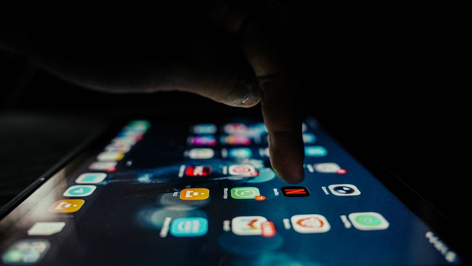
Push notifications can make repeat visits https://dgmnews.com/bingo-plus-app-a-more-flexible-way-to-access-digital-entertainment/ faster by giving users a direct entry point to something they already care about. A reminder to continue a saved activity, a relevant update, or a notice about a followed topic can spare someone from reopening the app and searching from the beginning.
But convenience depends on relevance. Sending the same generic message to everyone may increase opens briefly, but it can also train people to ignore alerts—or turn them off entirely. Use a person’s settings and stated interests to shape what they receive. If someone follows a topic, remind them about that topic, not every new item in the app.
Make the tap destination match the notification. If an alert says there is a new update, it should open the update. If it points to an event or feature, avoid making the user navigate through several unrelated screens first. Fewer taps make a return visit feel purposeful rather than like work.
Companies such as BingoPlus and products such as the Bingo Plus app can apply this principle by treating alerts as signposts, not as a reason to interrupt people. A notification should help users reach a relevant place; it should not pressure them to spend time or money they did not intend to spend.
Keep the interface familiar across updates
Consistency makes notifications easier to trust. If the app changes its layout or labels with every update, people may not recognize where an alert leads or how to complete the next step. A familiar interface helps users act quickly, especially during short sessions.
Keep key navigation labels, notification preferences, and important actions in predictable places. When a design change is necessary, explain it in the app and make the new path easy to learn. Do not silently rename a feature that an alert refers to, or send people to a page that no longer matches the message.
Consistency also includes the notification itself. Use a recognizable app name and icon, maintain a steady tone, and make sure the alert’s wording matches the language on the destination screen. For example, if the notification calls something “saved stories,” avoid labeling the destination “bookmarks” unless the relationship is obvious.
Notification choice Why it helps What to avoid Specific subject and action People can decide whether the alert matters at a glance. Generic messages such as “Something new is waiting.” Direct link to the relevant screen It saves taps and makes repeat visits easier. Sending every alert to the app’s home screen. Clear cost information It supports informed decisions and builds trust. Leaving out pricing, fees, or deposit amounts. Visible controls and preferences People can choose what they receive and when. Making alerts difficult to pause or manage.Respect short sessions and low attention time
Not every app visit is a long browsing session. Someone might open an alert for a few seconds, check one update, then return to whatever they were doing. Design for that reality: make the important information easy to find, reduce unnecessary screens, and let people leave without losing their place.
Do not assume that an open means the notification was welcome. A person may tap simply to clear an alert or check whether it is important. Measure success in more thoughtful ways: Did the alert take users to the right content? Did they complete the task? Did they later disable notifications or uninstall the app? Opens alone do not show whether an alert was valuable.
Timing matters, too. Avoid sending routine messages at inconvenient hours. For non-urgent updates, consider letting people choose a digest or a preferred time. For reminders, make sure the user has a meaningful way to control frequency. A useful alert fits into someone’s day; it does not demand that the day revolve around the app.
Give people real user control
User control is not a small settings detail. It is part of the value of the notification experience. Ask permission in context, explain what kinds of alerts the app sends, and let people change their choices later. A single on/off switch may be simple, but topic-based controls can be more useful when the app sends different kinds of updates.
People should be able to pause alerts, turn off specific categories, or change quiet hours without searching through a maze of menus. Respect device-level notification settings as well. If someone has disabled alerts, do not repeatedly pressure them to enable them again.
Social sharing should also be a choice. If a service offers a Facebook share option, make it clear what will be shared and where. Do not treat sharing as a required step to access an unrelated feature, and do not send a notification that implies a person has shared something when they have not.
A simple checklist before sending
Before publishing a push notification, review the message and the full mobile journey—not just the copy in isolation.
- Purpose: Can the user tell what happened and why the alert matters?
- Relevance: Is it connected to an interest, action, or setting the person chose?
- Accuracy: Does the wording match the destination and current app interface?
- Transparency: If money is involved, are pricing, fees, and deposit amounts clear?
- Destination: Does tapping open the specific page or task promised?
- Mobile usability: Is the text readable and the next step easy on a small screen?
- Control: Can people manage the type, timing, or frequency of alerts?
- Timing: Is the alert worth interrupting someone right now?
Useful means helpful, not merely noticed
The best push notification is not necessarily the one that gets the most taps. It is the one that makes a relevant moment easier: it gives a clear reason to act, sends the user to the right place, and respects their time and choices.
For a news product such as DGM News, that might mean a clear alert about a topic the reader follows. For BingoPlus or the Bingo Plus app, it might mean a relevant, transparent update with a direct route to the corresponding screen. In every case, the standard is the same: be specific, be honest, make the mobile journey easy, and give people control. That is how apps can avoid irritation and earn attention instead of demanding it.